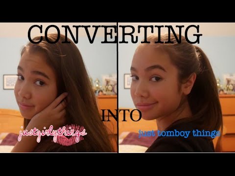
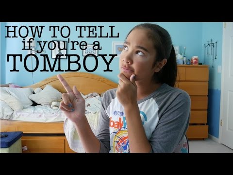
 When it comes to YouTubing, most of the successful channels are made by adults. That doesn't mean that kids don't have channels. A lot do, whether it's about gaming, vlogs, niches, or whatever kids make channels about. However, it's not very common to see success on YouTube as a kid. YouTuber just tomboy things, who's dedicated her channel to all things tomboy, has seen her share of the (possible) YouTube stardom. With over 58,000 subscribers and 5,097,530 views (3/21/18), she could be well on her way to YouTube fame. I wanted to find out what she was like, so I sent her a message and asked for an interview. Here's the full email exchange between us: ME: Why did you start YouTubing? JTT: I started mostly because I watch YouTube a lot and it seemed like something that was fun and enjoyable. It's like an easy creative outlet where you just film whatever you want for people to see (and personally, how many people do see it doesn't really matter as long as they enjoy it too). ME: How long did it take for you to get to 1000 subscribers? JTT: I don't remember, but somewhere around the end of five to the early of six months? Late December and I started in early July. ME: How did people find your channel? Did you share it with your friends, social media, etc? JTT: Honestly, I purposefully tried to keep people that I knew personally from finding out, but one friend found out somehow and told another friend who told more friends and so on. Other than that, I have no idea how people discovered my channel. ME: Who are your favorite YouTubers to watch? JTT: I really enjoy watching Liza Koshy, Nigahiga, Jacksepticeye, and RobertIDK. ME: What's your most valuable tip for new YouTube content creators? JTT: Honestly, I don't have any big ideas about what they should do. Just do whatever you know you enjoy doing, and people will naturally come. Don't force yourself into a concept because you'll regret having to stick to it later. If you have fun making your content, that's what matters most! Check out her channel at: https://www.youtube.com/channel/UCozNgN36hSD4Mh1Ftf5AGtQ.
0 Comments
 If you've been thinking about starting a YouTube channel, this guide is for you. YouTubing can be really fun and it can also bring in a bit of cash. However, it's often not the best idea to go into YouTubing without some filmmaking experience or at least a guide so you don't start off on the wrong foot. I love YouTubing and love filmmaking. It's awesome to share it with the world, and YouTube helps me do that. If sharing your passion to the world sounds like something you want to do, then YouTube is probably for you. YouTube gets around 5 billion video views each day. If you want to have your share of these views, this guide will help you start up your channel from thinking of channel ideas to promoting your channel. Before I guide you through the process of making a channel, I want to say a few things. First, Success is not guaranteed, but increases your likelihood of becoming successful. I can't personally guarantee that your channel will work out, but following these steps will give you a head start. Second, Take your time. Rushing through the process is not going to get you more success just because you started earlier than you would have. I've tried rushing it and it doesn't always work out. Taking it slow and really putting effort into it is going to bring out more results. You'll need to be patient and be willing to wait. Success on YouTube can come in a few months, or it can come over the course of a few years. Third, Focus your free time on setting up your channel and put a lot of effort into it. Don't expect to do a day's worth of work and get results. You'll need to spend at least a week setting up your channel, but I'd recommend at least two weeks. Fourth, Don't give up. Success may be instant, but it may also be very slow and tedious. If you give up, you'll have no chance of hitting it big. Success can take anywhere from a couple months to a couple years. Remember, subscribers matter just as much as views, and vice versa. If you have a lot of views, but not a lot of subscribers, that means that you might have clickbait videos. If you have a lot of subscribers and not a lot of views, then you have boring videos or a not active fanbase. Never buy subscribers or views. This is probably the dumbest thing you can do. It doesn't give you repeat views, and the subscribers won't watch any of the videos, so you'll end up with next to no views. You can also get your channel banned if YouTube catches you. The first thing that you have to do when starting a YouTube channel is to think of ideas. A helpful way to keep track of all your new channel ideas, video ideas, and social media related things is to keep a "Creator's Log". I find this to be very helpful. Think of some things that you're passionate about. It can be gaming, filmmaking, fitness, cooking, DIYs, or something else. Jot down your top three and choose from one. Once you've decided on one, think of a creative name. Try to make it somehow related to the topic you're choosing. Make sure it's rememberable. Don't make it something really long. Make it easy to remember. Don't use a username such as Joey62923. Use something like MasterChef instead. After choosing your name, you'll need to think about the types of content you'll be creating, and the audience you're trying to show your video to. If you're making videos about fitness, maybe your audience is people who want to get fit. Or if you're making videos about cooking comfort food, maybe your audience is people who want to cook comfort food. Next, I'm going to give you some tips on Videos, Channel Art, Filming Gear, and Social Media. Topic #1: VideosVideos are the core of your channel. My first tip is to Post Quality and Quantity, and have a set upload schedule. If viewers can expect when you'll post, they'll be more likely to subscribe. Set some expectations for your viewers by letting them know that you'll be posting maybe 1-2 times a week, or on saturdays, etc. There are also some people who say that you should post quality over quantity. However, if you don't produce enough videos, your viewers will eventually unsubscribe. On the contrary, if you don't produce quality videos, viewers will not want to watch them. That is why you need both Quality and Quantity. When making videos, there are steps: 1) Ideas - Think of video ideas. Plan out what you're filming, when, and where. 2) Filming - Film your video. 3) Editing - Edit your video. Use something free like iMovie, Windows Movie Maker, DaVinci Resolve, or Shotcut. Use something paid for like Premiere Pro, Sony Vegas, or Final Cut Pro. 4) Uploading - Upload your video after exporting it. Make sure you include a detailed title, a lengthy description containing social media links, a video summary, links to other resources, and a message encouraging viewers to subscribe and like. Don't forget to add a custom thumbnail and some tags for your video. Use a lot of tags. Think of things that your viewers might search to find your video type. 5) Promoting - Share the video link on your social media accounts, or tell friends and family about it. Topic #2: Channel ArtChannel art helps viewers understand what your channel is about. There are two types: Channel Art and Profile picture. Channel art is the main piece of artwork for your channel. Here are some things you need to include in your channel art: - Your channel name - Social media - Some image that relates to your channel Search up guides on how to make channel art for your specific niche/channel topic. Channel art differs from topic to topic so I can't give any general guidelines right now. For your channel logo, it's good to include something that relates to your topic. For a Cooking channel, you might want to include a picture of you in the kitchen. For a film channel, you might want to include some text that displays your channel name, or just a picture of you. Topic #3: Filming GearFilming gear isn't as important as the other topics. It doesn't matter about the video quality as much as the story. The video has to be interesting. Even if it's low quality video, people will watch it if it's a story that intrigues people. However, if you do want to increase your video quality, use .mov format and H264 codec. You can also toggle between 720p and 1080p. 1080p is preferred but it's not always necessary. 60 fps is also better than 30fps but either one is fine. Here are the parts of a basic filming kit: - A Camera - A Tripod - A Microphone(not always needed) - A Recording Area Cameras There are three types of cameras: DSLR, Point-and-Shoot, and Mirrorless. I'll just be talking about DSLRs and Point-and-Shoots. DSLRs are (generally) better than Point-and-Shoots. See my comparison on DSLRs and Point-and-Shoots. They are also more expensive. I have a DSLR to record, but it doesn't matter a lot which camera type you have. Tripods This is something that doesn't matter a whole lot. I'd recommend having a small tripod and a longer, extendable one. Microphones There are a few types of microphones. If you're doing an interview, you should use a lavalier, or a clip-on microphone. If you're recording nature, for instance, use a shotgun. Shotgun microphones can be attached to the camera and plugged in through a auxiliary port(audio jack). The brands I'd recommend are Senheiser and Rode. Recording Area You'll also need a recording area. Use some place that doesn't have a lot of echo, such as a carpet-floored room or somewhere that has a lot of pillows. Topic #4: Social MediaSocial Media can be a great way to promote your videos. The two I'd recommend are Twitter and Instagram. On these platforms, use them to notify followers about new videos, updates, giveaways, collabs, and other info about your channel. Make your username something that is recognizable, such as your youtube name or something similar. Social Media is crucial in promoting videos. It's a high traffic source of video views if you do it the correct way. ConclusionIf you're inspired to start your own YouTube channel, remember to Take your Time. Don't rush through it and really put a lot of effort into making it good-looking and interesting.
Good luck on your YouTubing adventure! A makerspace is any area where you make things. Common tools include 3D printers, laser cutters, and a soldering area, but there are a lot more tools than that. It can also just be a low-cost makerspace with things like straws, cups, CDs, string, and other things like that for smaller kids.
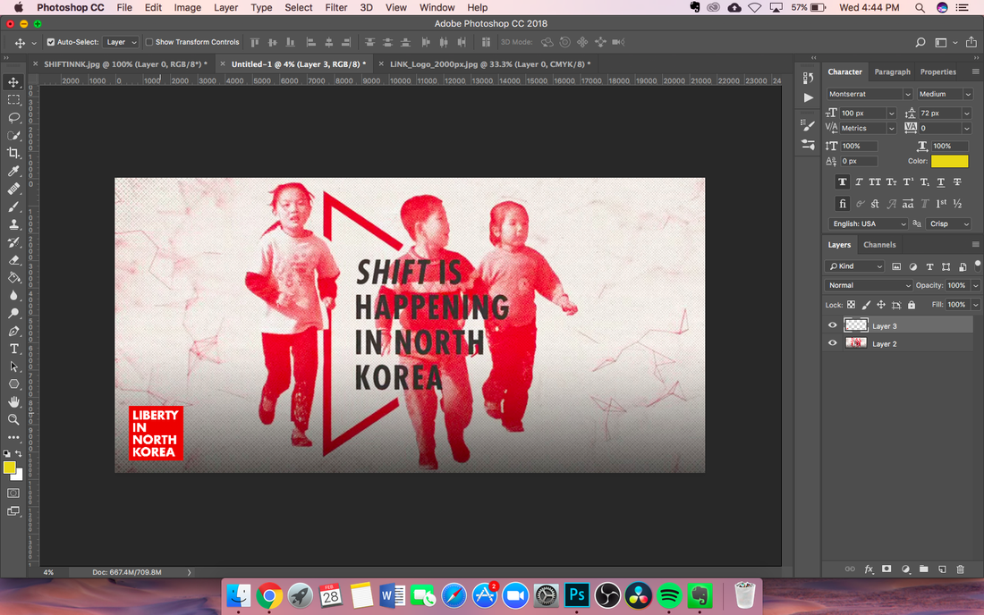
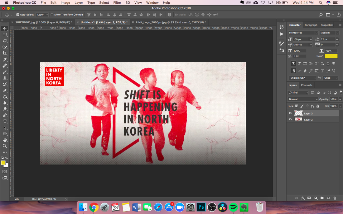
I've been experimenting with starting a home makerspace. However, it is quite costly, so I decided against it. It's still an option for those who want to have their own and are willing to spend at least a few thousand bucks on some gear. Here's the list of things that I'd use that are also annotated regarding brand, cost, size, etc. Building parts: Screws - Get a big kit Nuts and bolts - Get a big kit Cable ties Rubber bands String - Not yarn Tools: Screwdriver Wire cutter Hammer Pliers Tape measurer Scissors - Adult scissors Ruler Writing: Pens Pencils Felt markers Colored pencils Sharpies Eraser Sticky Stuff: Hot glue guns Glue sticks Elmer’s glue Tape Stapler Paper: White paper Cardboard Lined paper Graph paper Card stock Science: Goggles Gloves Pipettes Test tubes/rack Safety: Lab coat Cleaning supplies: Sponges Towels Napkins Containers/misc: Plastic containers, Tupperware Bowls Cups Spoons Forks Knives Chair Power strip USB Drives SD Cards Whiteboard/Markers/Eraser Maker tools: Soldering iron - Make sure it's high quality! 3D printer - Prusa 3D: They make really high quality 3D printers and have received multiple awards from Make: magazine. Windows Computer - In case you don't have a mac, you will need this for 3D printing/laser cutting! Raw Materials: Filament(PLA, ABS, PET - 1.75 mm) - This is for the 3D printer Makerspaces can be a great way to unleash your inner creativity through physically making things. This list should hopefully inspire you to invest in your own makerspace and start creating! Today's Real World Design post is about taking fast action pictures. I find myself wanting to take pictures while I'm in the car or take pictures of something that's moving, like a person running or a ball being thrown. Before I got my DSLR, I didn't even know how people took fast-action shots. I had a cheap PowerShot point-and-shoot that I could only control the ISO on. So whenever I took a picture in the car, it always turned out blurry. However, after using my DSLR and learning about shutter speed, I started taking shots while moving at 60 mph on the highway. This expanded so many capabilities and possibilities for new, creative shots. When I was thinking about a post to write about, I stared out the window and watched the water drip off the patio umbrella. Then I realized that I could take some shots of the water dripping and get some cool shots. If you want to try this for yourself, grab your camera and set it to a high shutter speed. 1/1000 will do, but you can go higher if you want. Next, set your aperture to the lowest f/no it can go. This will make the photo brighter. If it's not bright enough, adjust the ISO until it's bright enough to see the water. If you're using AF(autofocus), focus on whatever is dripping the water(if it's not far away) and then focus on the water droplet to make sure it focuses correctly. Otherwise, it might focus onto the background since the water drips too fast for the camera to focus on it. See the shots below for some inspiration! I'm going to be starting a new series of posts: RWD, or Real World Design. These posts will include design in the world, like logos, banners, websites, and more. I'll also include steps for the work I do so you can get a sense of the things I do for companies. Today's RWD topic is going to be on a banner I made for LiNK, or Liberty in North Korea. They are a nonprofit helping refugees that have crossed the North Korean border. You can learn more about them at https://www.libertyinnorthkorea.org/. A while ago I sent an email to the company asking if I could do some free work for them, and I got a reply back saying that people would be emailing me with their projects soon. As soon as I got one, I started working on it. This was from someone who wanted a banner to hang up at a public location to raise awareness. She had an image already that I was to use in the project, and also requested that I add the logo in. Here's the final banner(I just resized it and added the logo): 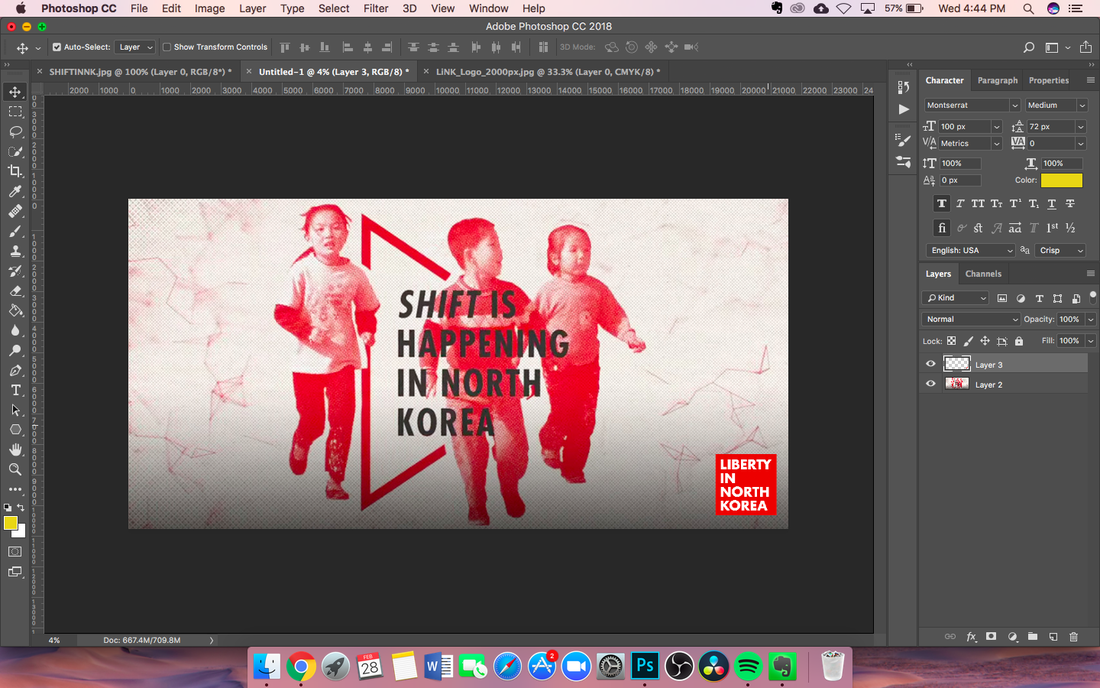 The banner size was so big(6' x 3') that I just took a screenshot of what it [pretty much] looked like. The image in the center was given to me; I didn't even add the text. That was there already. The first thing I did was make a new document and drag the image into it. The image was tiny and not nearly big enough to scale, but I did anyways with okay results. 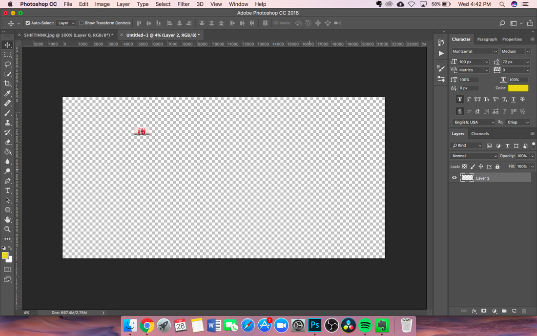 I then proceeded to resize it and adjust it to the correct size. 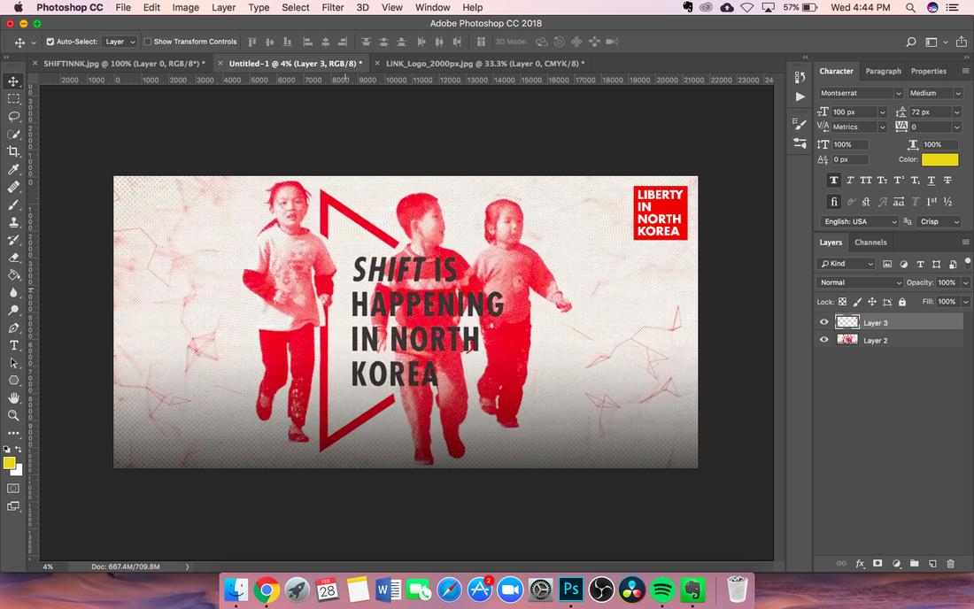 I also grabbed the logo off the internet and added it into the document. The logo was surprisingly big, at 2000px by 2000px. I didn't even have to resize it to make it bigger. Then I had a problem: I needed to decide which corner to put the logo in. I've put the four different images below so you can compare.
The pictures with the logo on the bottom looked the best, so I decided to go with the logo on the bottom right. Top left and bottom right are both good places to put the logo for a clear message. From there it was easy sailing and a lot of waiting. The last thing I had to do to edit the image was to make sure that the logo was equal distance away from the edge of the image. 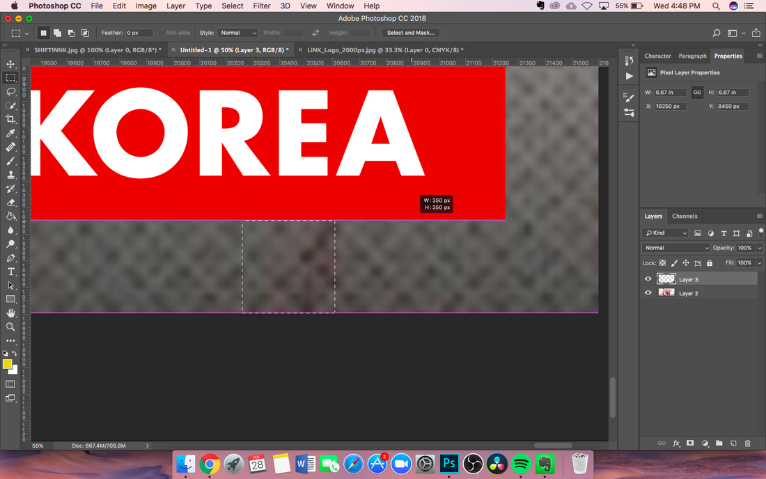 The Marquee tool is a good tool to use for aligning elements when you're not sure if they are. Here, I used it to measure the distance between the edge of the image and the logo. I exported the image in a .pdf file and also saved it as a PSD, just in case I wanted to edit it later. Exporting both of them took about 2 minutes each, maybe a little less for the PSD. 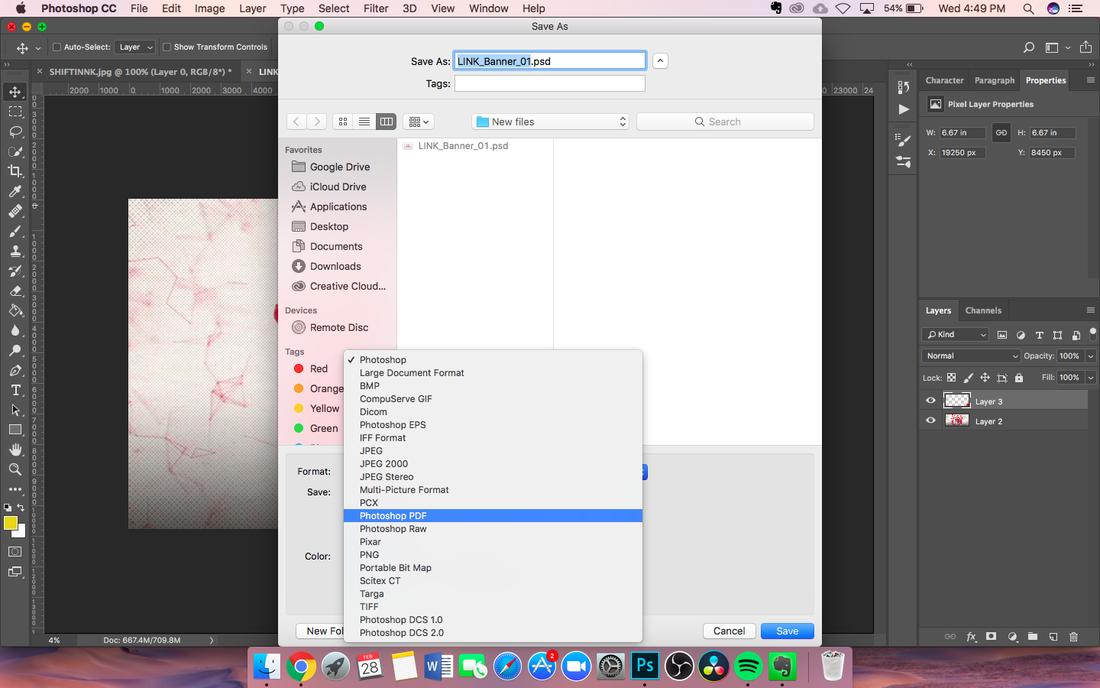 The last thing I had to do was to zip the folder with the artwork and send it over. The zipping took about 5 minutes and uploading it took around 20-30 minutes. 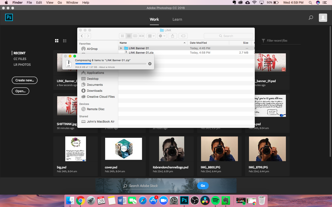 This design project was pretty simple and the whole process of making, exporting, and uploading it took me around 1 hour. Two-thirds of the time was taken up by exporting, zipping, and uploading the files.
More RWD on the way! Painting with light is a way that you can use photography to create some amazing art. Painting with light involves a high shutter speed, a high f/no or aperture, and a low ISO. It can be pretty cool to see the things that you can make from this. 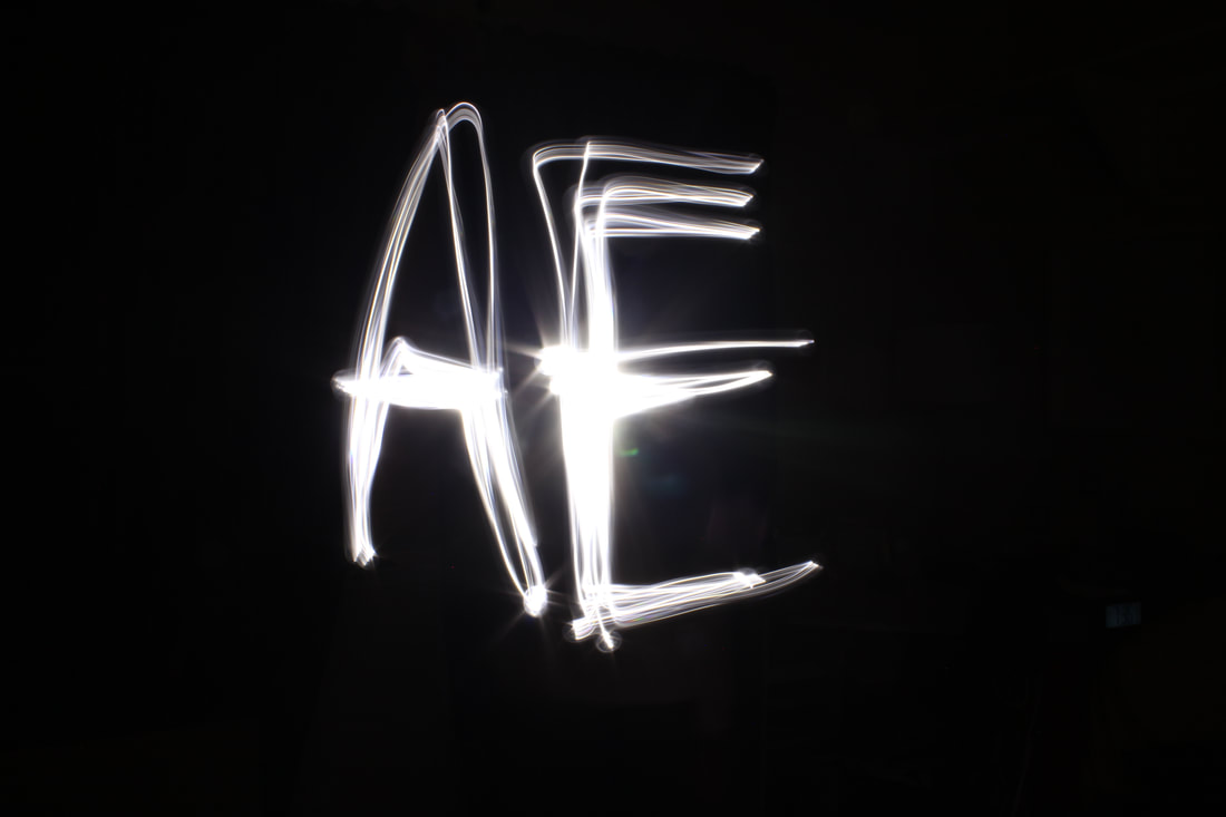 So, how do you do this? The steps are pretty simple:
First, you'll need a high shutter speed, around 20"-30" or so. It works with a lower shutter speed, you'll just have less time to make the painting. Set up the camera in a room. Second, have someone stand in the center of the frame with a flashlight. Turn off the lights, then turn on the flashlight and paint. It will capture whatever you draw, so make sure that you don't have random streaks across the painting. You can make some pretty cool things with light paintings, such as adding wings to a person(use a higher ISO and f/no(aperture) so the person shows up in the image too) or painting a word. This is just a basic tutorial and there are so many ways to experiment with this. There are images of light with different colors, drawings of people, drawings of cars, bikes, and various other items, as well as just some abstract painting. For more inspiration, just search up "painting with light" and you'll get a ton of results and ideas to do. Happy light painting! Cameras can be confusing. There are a ton of shooting modes, and so many settings to configure. Today we’ll be going over arguably the most important three: Shutter Speed, Aperture, and ISO.
First, what are each of these things and how do they affect the image taken? Shutter speed is how fast the optical mirror moves up to expose the sensor to light. A slow shutter speed(i.e. 1/5) will produce an image with a lot of lighter, since the sensor measures the light more than if it were a faster shutter speed. A fast shutter speed(i.e. 1/800) will produce an image that’s darker. Aperture is the area in focus. A low aperture will focus on a wide range of things, and thus let in more light, while a high aperture focuses on a spot, letting in less light. ISO is how sensitive your sensor is to light. Camera sensors like CMOS's and CCDs take in light and turn it into electrons to be sensed by the camera, then turned into an image. ISO values tend to double, so values like 100, 200, 400, 800, and so on are common. An image with 400 ISO is going to be 2x brighter than an image with 200 ISO. ISO stands for International Standards Organization. Although the name sounds like a very broad group, it’s actually just focused on ISO in photography. So, how do you use these three to capture the perfect image? It might seem easy, but there’s a method to doing it. The first thing you always want to do is identify your subject and adjust the zoom on your camera. Next, change the aperture until it’s at the setting you want. Remember that a low aperture will focus on a wide range of things, while a high aperture focuses on a spot. The next step is changing the shutter speed. A good guideline is to stay in the range of 1/10 shutter speed - 1/400 shutter speed. If you need a special shot, this can be adjusted, but it’s not recommended as it will make the photo really light or really dark. If you’ve entered a shutter speed value of somewhere in between 1/10 - 1/400 and it still looks too light or dark, then it’s time to edit the ISO. You don’t want to change around the ISO too much, as on lower quality DSLRs/other cameras it will make the image appear grainy. A good rule of thumb is to stay in the range of 100-1600 ISO, only using 3200+ in dire situations. Hopefully these tips should help you take better shots! First, adjust your zoom. Second, adjust the aperture. Third, adjust the shutter speed. Fourth, adjust the ISO. And lastly, take the shot!  Watermarks are annoying. I want to use images that are free and unbranded, not ones that have a logo stamped on them. If you want to use free, high quality images, use unsplash.com. Today I'll be showing you how to remove a watermark from a photo. The watermark has to be one with a small logo at the bottom, not the big stamp like 123RF's(I seriously hate them). You can remove the watermarks from photos like those, it would just take a lot of time. That's the point. But if you're using it for some non-commercial reason, this guide will help you with smaller watermarks. You'll need Photoshop, of course, as well as the image downloaded. I'm using this image, but you can use whatever you want. (Sorry, couldn't find the link! Downloaded this image a while ago.)  There it is, the annoying little watermark. Let's get rid of it. The first way to do it is by using the clone stamp tool. The clone stamp tool takes a source(which you can set by pressing option while clicking the area you want to duplicate) and then sends it to another location. Keep in mind that you can't clone the same image with the same source at different locations. Try it: select a source, then click on the left side of the screen. Then click a little bit away from it. The images are not the same. You have to set the source every time you want the same image. Anyways, you can do that with the clone stamp tool. As the arrows show in the picture below, I cloned the sources above and put them on the watermark, setting a new source every couple times I clicked.  Removing the watermark that way is really easy. It shouldn't take more than a minute or so. The next way to remove a watermark is by using the Spot Healing Brush Tool. The Spot Healing Brush Tool has three modes: Content-Aware, Texture, and Proximity. Use Content-Aware for now. The Content-Aware mode tries to blend the selected piece in with the rest of the background. It's a brush tool, and it highlights the selected area in a black brush with the opacity turned down, like so:  Cover the watermark and some of the surrounding environment, then let go. After a second or two, it should blend in. This is my final result:  If you have something that has a complex background, it's not going to blend as well. The last method is to use the Healing Brush Tool. You have to set a source like with the clone stamp by holding option, but it takes the texture and tries to blend it in with the colors around it. It's also repeatable, so the image doesn't change.  As you can see, it's not as well blended in as it could be, but with some extra work you could make it better.
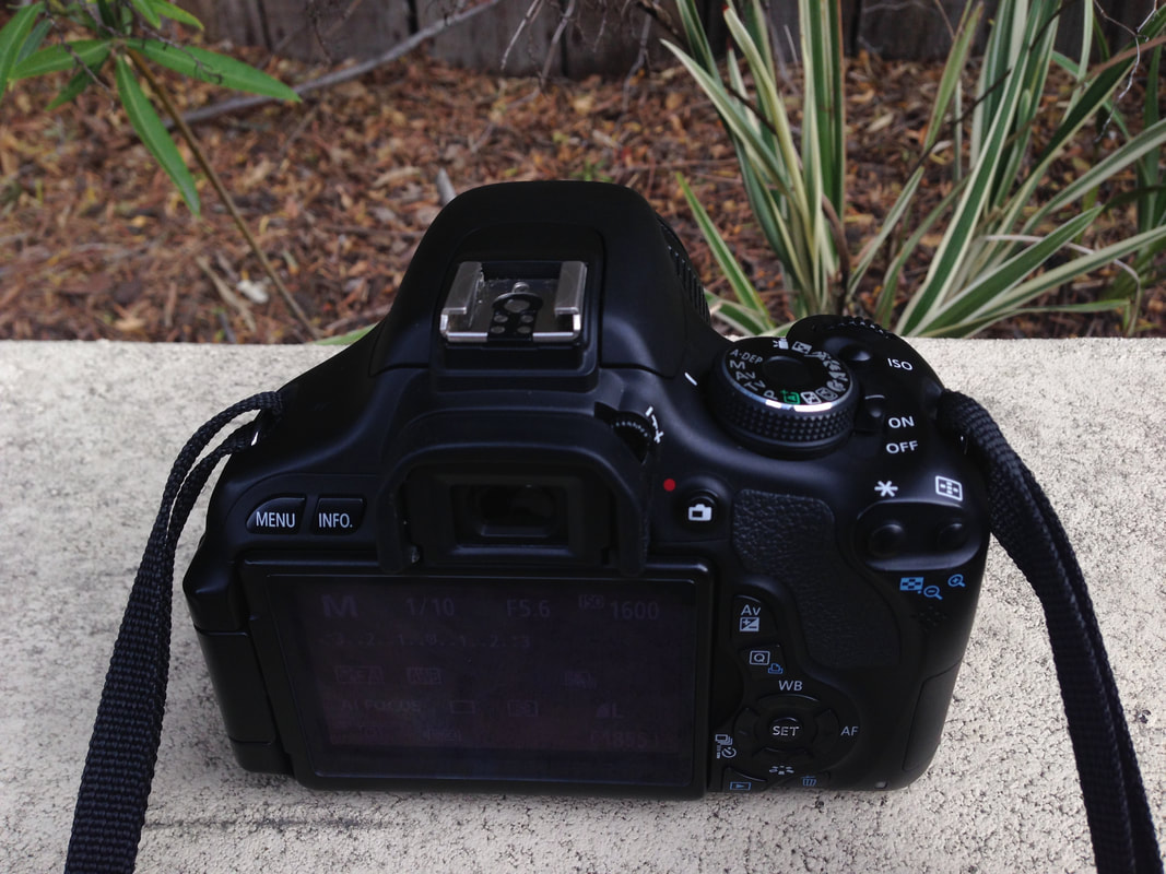
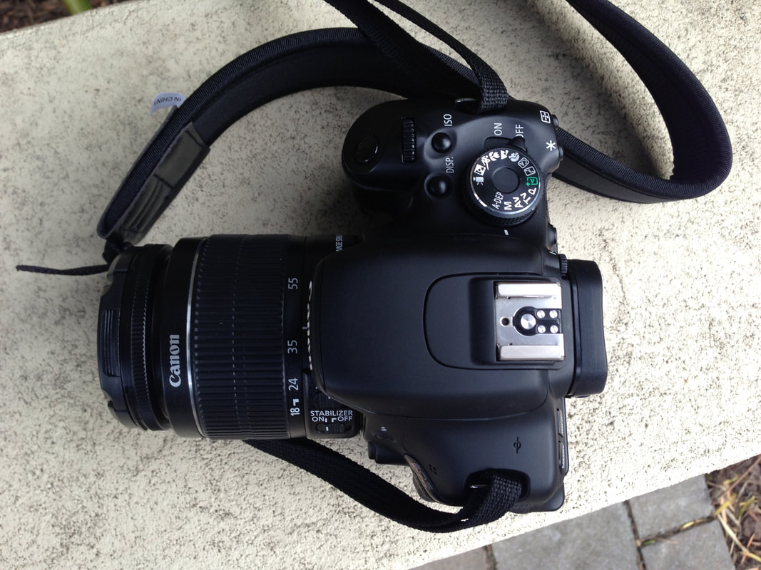
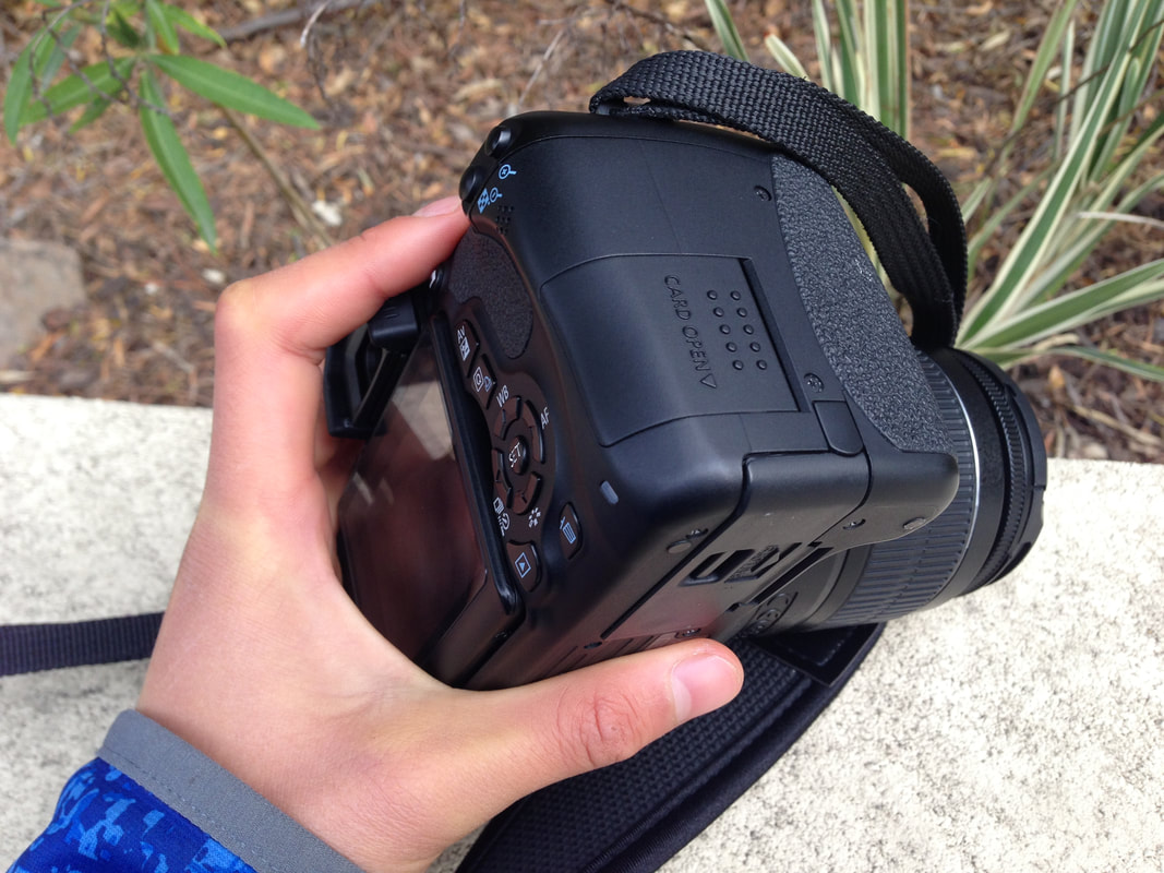
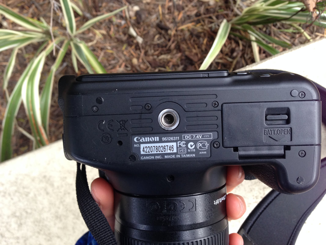
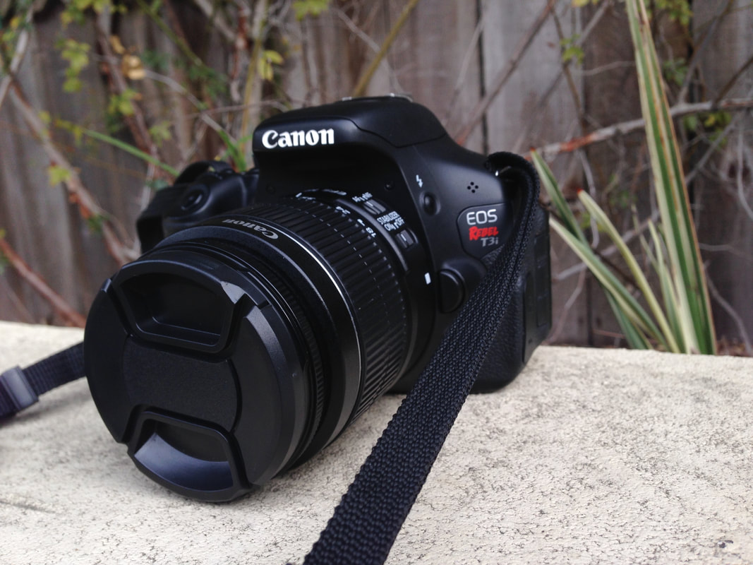
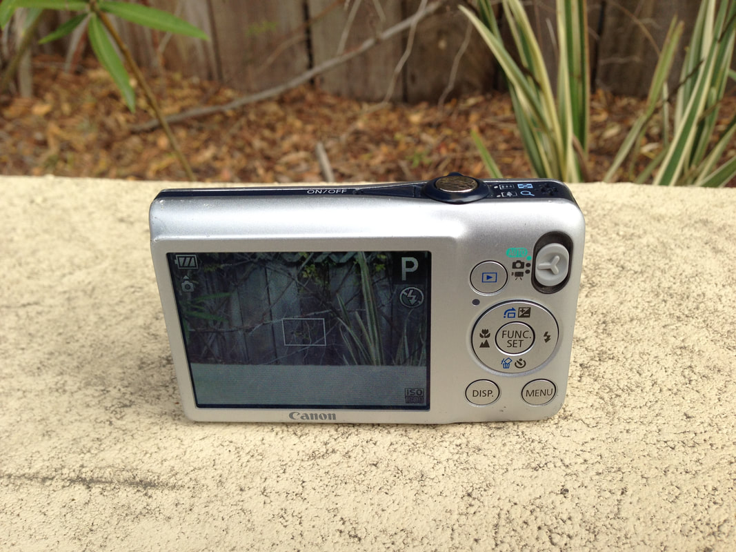
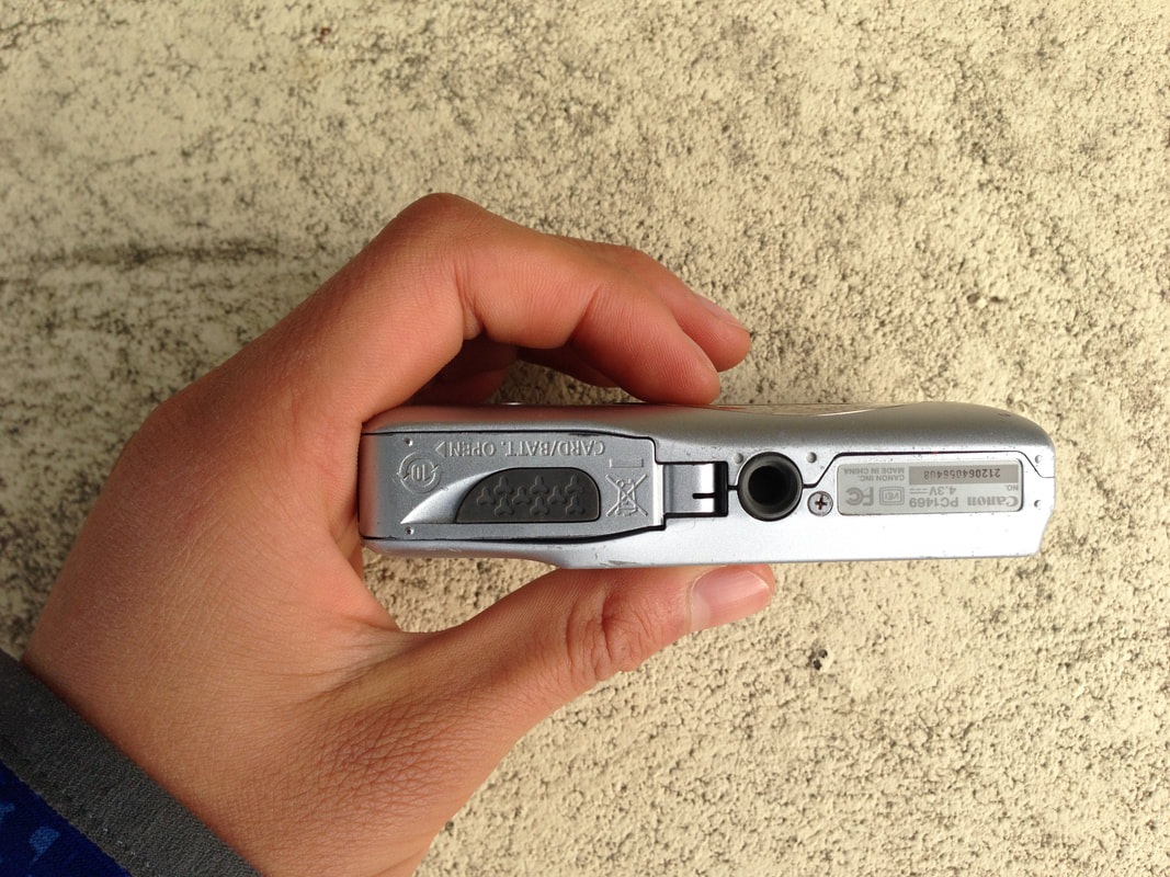
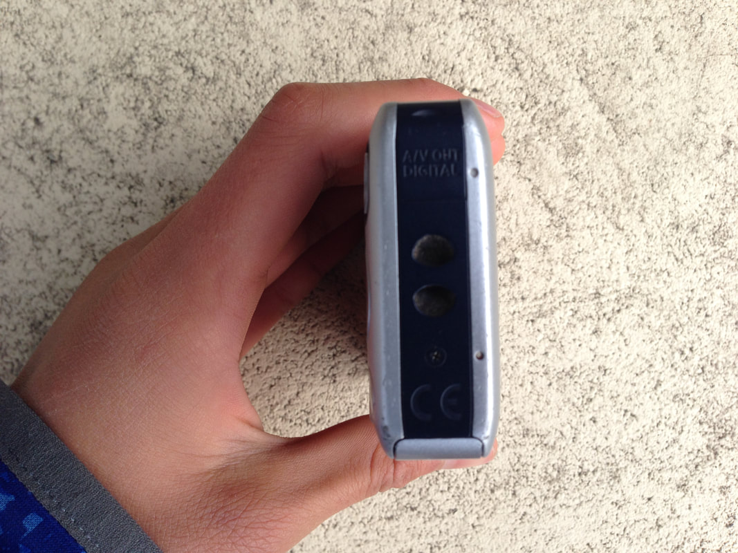
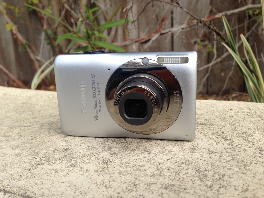
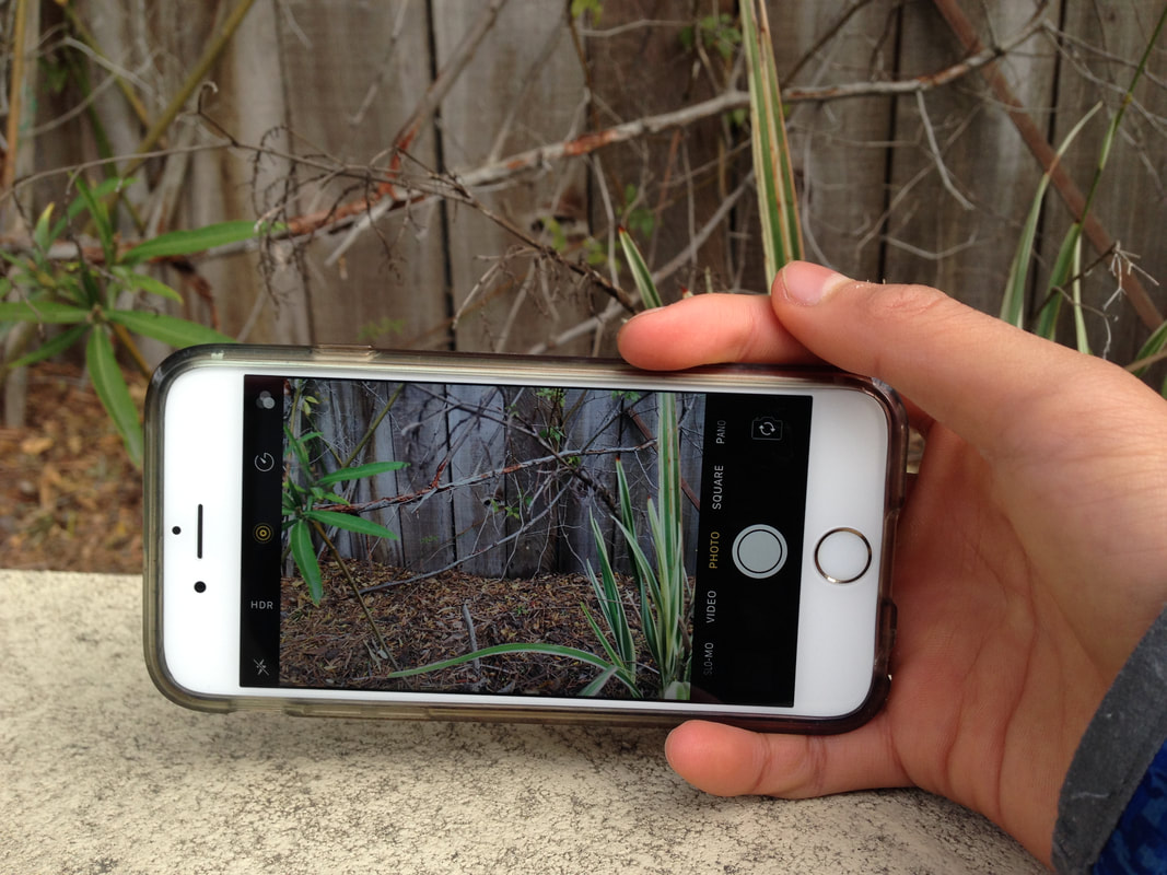
So that's how you remove a watermark three ways! If you have a method, share it in the comments. All of these are simple and should take no more than a minute.  I just got a new camera, the Canon EOS Rebel T3i, so today I'm going to be doing a comparison of three different cameras: a DSLR(Canon T3i), a Point and Shoot(Canon PowerShot SD1300 IS), and an iPhone 6S. I'll be doing a review/guide on the T3i sometime later after I've mastered the camera but I've spent a day with the camera and I'm starting to get the hang of it. The main categories we'll be going over are: megapixels/image quality, functions(internal and external), and cost. Keep in mind that the T3i costs the most for the camera, and it produces the best quality images. However, it costs a whole lot more and is a lot harder to use because of all the functions and lenses. Test #1: Auto Shooting ModeThe Canon cameras both have dedicated Auto Modes, but the iPhone is only auto, I believe. There doesn't seem to be a way to set ISO or exposure. Auto Modes basically set ISO/exposure for you automatically so you don't have to do any work.
The iPhone actually seems to have the most detail here. The PowerShot has a very bad image quality. The T3i doesn't have as much contrast as the iPhone. test #2: Program Shooting ModeAgain, both of the Canon cameras have dedicated Program shooting modes, while the iPhone only has an automatic shooting mode. The Program Shooting mode sets the shutter speed and aperture automatically for you, but lets you set ISO, WB, focus, as well as some other things.
The Canon T3i definitely has the best quality here. It's bright and high quality. The other two don't have enough but the iPhone needs more than the PowerShot. Test #3: FunctionsHere, we'll look at functions, both internal and external, like the ISO range, as well as stereo inputs/outputs.
If we compare external functions, the Canon T3i definitely has the most by a long shot. There's not even an HDMI/mic input for the iPhone and the PowerShot. Now, let's compare internal functions. We'll be taking a look at three main functions: ISO range, Aperture range, and Shutter speed range. The iPhone doesn't seem to have these functions available to edit so I'll just compare the two Canon cameras. The Canon PowerShot has two image shooting modes: auto and program. Neither allow you to set shutter speed and aperture, so those don't really matter. The maximum ISO on it is only 1600, which is quite low. The Canon T3i has a Manual Shooting mode which enables full customization of the photo. The biggest shutter speed value is BULB, or until you take your hand off the shutter release. The smallest shutter speed value is 1/4000th of a second. The lowest aperture is 4.0, and the largest is 25. The minimum ISO is 100 and the maximum is 6400. If we compare external and internal functions, the T3i is a clear winner, but not without some previous knowledge. Test #4: Image QualityThe Canon PowerShot can take an image at a max of 12.1 megapixels. The image dimensions are 4000x3000. The Canon T3i can take an image at a max of 18 megapixels. The image dimensions are 5184x3486. The iPhone 6S can take an image at a max of 12.1 megapixels. The image dimensions are 4032x3024. Here's another set of images taken by each camera.
The iPhone 6S has terrible lighting, and the Canon T3i has just a little sharper quality than the PowerShot. The image taken by the PowerShot is a lot blurrier. TEST #4: CostThis will be for the body, and in the case of the T3i, the lens as well(an 18-55 mm lens). All prices are taken off Amazon.com. The iPhone 6S was about $325 for a new one with 64 GB of storage, but the price went down to $275 for a 16 GB one. You can buy it here. The Canon PowerShot SD1300 IS was around $30 for the silver version but went up to $400 for a brown colored one. You can buy it here. The Canon EOS Rebel T3i costs around $770 for a new one but around $325 for a used one. This includes the 18-55 mm lens which costs around $100. You can buy the entire kit here. ConclusionSo, which camera is the best? For the cost, I'd say it would be the PowerShot. It takes medium quality photos and is really cheap. For the quality, no doubt it's the T3i. And for simplicity, I'd go with the iPhone 6S. However, the iPhone 6S doesn't seem to have good lighting, but has okay contrast/colors.
If you're trying to decide between a point and shoot and a DSLR, here's some advice: if you've already used a point and shoot before, buy a DSLR. If you haven't used cameras that much(and be modest) then get a point and shoot. Point and Shoots are a lot simpler, easier to use, cost-effective, get the job done, and are also lightweight. DSLRs do have advantages over Point and Shoots but I'd recommend a point and shoot as a first camera. Do NOT start with a DSLR if you've haven't used a camera before, or have little experience(again, be modest). So far, my T3i has been working great and I definitely recommend it as a camera! It also has an articulating LCD meaning that the LCD can flip out and turn around 180 degrees so you can see it while filming yourself. The T3i is discontinued but it's still a great entry-level DSLR. 
Did you know that ads with red as a primary color are more likely to convert viewers into customers? Red is also the color that makes people hungry. In this blog post, we’ll be discussing colors and how it has an effect on the viewer. Our first color is red. Red is an excitement color and actually makes people’s heart pump faster when they see it. Red is a bright, flashy color that also attracts people’s attentions. It can be used for things like converting viewers into customers, or to depict something scary. It’s also a popular color in the food industry, as many companies including McDonald’s, Wendy’s, Burger King, In-n-Out, Costco, KFC, and a ton of others use red as a primary color. Why? Red has statistically shown that it’s a factor people unconsciously consider when looking at food options. Red is also the color of romance, lust, and love. Yellow is similar to red in that it’s an upbeat color, but at a much lower level. You’ll notice that many food companies use yellow as a secondary color, like McDonald’s arch. It’s also used to symbolize happiness, so if you want to convey to viewers that your product will make them happy, use yellow instead of red. Yellow is also a great attention grabber like red, since it’s a bright color. Green has a very specific set of emotions. Green tends to convey that your product is nature related. It’s also the color of envy/hate, in the case of the darker colors. But if you use the lighter/medium shades of green, you can get a message of “natural-ness” to your viewers. Blue is a very popular color, but when it comes to design, there are only a specific set of blues that are good for a set of conditions. Blue is used to convey high quality products or professionalism. If you need a color to go with a dark background, medium blues are good for this. In my opinion, you should never touch the light blues unless you absolutely need to. Pink is a stereotypical color of females, although in recent years darker shades pink is seen as a fashion trend for some people. However, lighter shades of pink make people think that the product is for females, so if your main audience is female, try to use pink to attract customers. Purple is the color of royalty. A long time ago purple dyes were hard to get so only the richest were able to obtain it. Naturally, kings and queens wanted it, and even today it’s still seen as a color of power and royalty. Purple is kind of a willy-nilly color that’s not used in a specific set of circumstances, nor is it even used that much. Only use purple if you need to. Don’t overdo it. Brown is similar to green, but it conveys a message more like “I’m tough, and you can be that way too if you buy this product” or simply just “I’m tough”. It shows a message of outdoor ruggedness. If you’re selling a product like backcountry tools(i.e. camping tools, survival kits), use green and brown. Black and white are opposites: black is a dark color that conveys a message of fear but also sophistication, while white is a color of happiness. Both are used as text colors. It’s pretty hard to tell when you’ll be needing them, but generally white works with both light and dark, while black doesn’t really see the spotlight that much. Colors really do influence emotion. There have been studies where volunteers have been asked to drink/eat out of different colored containers. The volunteers said that one color definitely tasted better than the others. Interesting! A lot of companies use these tactics to drive more sales and attract more people. It’s been tested many times and it works. What’s you’re favorite color? Mine is hot pink. Let me know in the comments below! |
Authori'm a 13 year old graphic designer based in california. i love to travel, play basketball, play video games, eat good food, read good books, and especially love design. my favorite type of design is modern. ArchivesCategories
All
|